
Alright folks, here’s the first time I’ll be giving you some news I’m not too excited about. But news is news!
Today’s news is going to be broken into two parts: In Part 1, I will share the news, and in Part 2, I will explain my stance and some history on the subject in 5 points.
So let’s get started talking about Rick Riordan’s Heroes of Olympus cover remakes.
(Also, I may or may not get a bit emotional in this post? We’ll see.)

PART 1
The Heroes of Olympus is getting some new cover art.
In celebration of the 10th anniversary of his Heroes of Olympus series, Rick Riordan announced that the series will be reprinted with new cover art by Nilah Magruder.
Yes, you heard that right – it’s been (almost) 10 years since Heroes of Olympus was first released!
Excuse me while I go and feel old.
John Rocco, who also did the cover art for the Percy Jackson & the Olympians series (and everything else in the Riordan universe), did the original artwork for the series when the first book was published back in 2010.

PART 2
I honestly feel a little betrayed, but let me explain.
DISCLAIMER: There’s no real dislike here. No shade being thrown. Because first of all… of course I’m going to buy all of these new editions immediately, but that’s only because I’m a huge fan in general. I always buy new editions of my favorite books!
~ ~ ~
As someone who only read Percy Jackson for the first time in 2012, I have no right to say that I’ve been here from the beginning. However, I’ve been in the fandom long enough to grow some strong opinions.
(read: get ready for some intense and likely unnecessary analysis of the matter.)
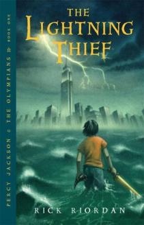
As I mentioned in one of my earlier posts, the Percy Jackson series did not always have great cover art. The First Edition of The Lightning Thief was created by Peter Bollinger , but shortly afterwards, John Rocco was hired to remake the cover and complete the art for the rest of the series. Since then, Rocco has done the cover art and character art for all of Rick Riordan’s later series.
In other words, John Rocco has been working with Uncle Rick since 2005.
Now here’s where is starts to get interesting: When John Rocco released the character art for some of the main characters (somewhere between 2009 and 2011, I can’t find the date), the fans were… not happy.

Based on the general critical response I have gathered, it seems that even though the fans were upset at these depictions (Nico in particular), they were not at all dissatisfied with the series cover art.
But since then – heck, even since The Lost Hero cover art – John Rocco’s has greatly improved.
Just to be clear, he did the art for the following series: Percy Jackson (5 books), the 10th Anniversary cover remakes of Percy Jackson (5 books), Heroes of Olympus (5 books), the Kane Chronicles (3 books), Magnus Chase (3 books), the fully illustrated Percy Jackson’s Greek Gods and Percy Jackson’s Greek Heroes, and the fully illustrated edition of The Lightning Thief.
(2005 version of The Lightning Thief vs 2014 Greek Gods)

So if John Rocco’s artwork has been an important part of the Riordan universe for over 10 years, this begs the question… Why would someone else remake the cover for Heroes of Olympus? Don’t the readers care about this change at all?
WHY I DON’T LIKE THE NEW ART
Keep in mind that I fully acknowledge Rick Riordan’s reasoning for the remake: he wanted something fresh and eye-catching for a new generation of readers.
But that doesn’t mean I have to agree with him!
That being said, I totally support the artist Nilah Magruder, and I have nothing against her at all. She’s been a fan of Rick Riordan’s books and even drew fan art in the past. I’m glad she got the opportunity to make art for this wonderful series (because honestly, who wouldn’t take the job?). However, I just don’t think this artwork change was a good choice for Heroes of Olympus.
1. John Rocco deserves more.
As you’ve probably picked up by now, I’m a little biased when it comes to having John Rocco do the cover art.
I mean, when someone does cover art for 15 years, and their art only gets better over time, wouldn’t you rather keep them on board? Or, at least, wait to get a new illustrator for a new series?
Rick Riordan, why would you do this? I just don’t understand. The man is perfectly capable of stepping up his own game. He’s already demonstrated so. Let him finish what he started.
2. The characters are supposed to be “faceless”.
Okay, this is probably my biggest complaint.
I read somewhere (I believe it was the 10th Anniversary Lightning Thief interview with Rocco) that the original artwork was done in such a way that the characters were “faceless”, meaning that the readers had to use their imagination to picture the characters however they wished.

But in these new covers?
That idea was completely thrown away.


I understand that many series, particularly in Middle Grade books, feature character faces on the covers. But for Percy and friends, it was kind of great to not see how each character was supposed to be imagined. I wanted to imagine them all in my own way, no rules. That’s why some authors give minimal physical descriptions of their characters!
The “faceless” idea also helped keep the characters more realistic in my mind.
3. Some people just don’t like change.
And I’m one of them.
Maybe I’m just being dramatic about this, but… shouldn’t all the books in the same universe (meaning they all include the same or similar characters in the same fictional world) be the same?
Personally, I will drop the series if the artwork doesn’t remain the same, and I’ve been doing this since I was seven years old.
I get emotionally attached to book artwork, and if it’s new, I will get so disoriented.
New artwork creates a different tone, a different mood, for the whole series. To jump from The Last Olympian to The Lost Hero for the first time with this new artwork would be a slight tragedy for me and any other child who is starting Heroes of Olympus.


It’s almost like… reading a completely different story.

4. It looks… just a little messy.
I think we can all agree on this.
The new artwork is not as clean or detailed as John Rocco’s previous work.

It’s a little too flat and a little too bright for my taste, but this is the least of my worries.
5. It also looks childish, especially compared to the other Riordan books.
Like I said, the color scheme of the new artwork is just not reminiscent of the previous books in the Percy Jackson series, or of the original Heroes of Olympus artwork.
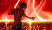
Just take a look at how intense this scene is for Mark of Athena…

… and then look at the new artwork.

Very different. It’s not even the same scene!
(Okay, now I’m just being picky.)
WHAT I DO LIKE ABOUT THE NEW ART
1. By itself, it’s fun and colorful.
After a lot of thinking, I discovered that one of the main reasons why I don’t like the art is because it is for once series which is a part of many other series
In other words, if Heroes of Olympus did not follow Percy Jackson, and was a completely standalone series, then this artwork change would not bother me.
That being said, the artwork alone is fun and bright/colorful, just like a lot of other Middle Grade books. It makes sense to want to add more color to the series, especially because the kids reading Percy Jackson stories seem to be getting younger and younger these days.
2. It appeals to a wider range of kids.
In relation to the point made above, I think the new artwork is more appealing to younger kids. The original artwork for Heroes of Olympus may have been a little too “dark” or scary-looking. But, the new artwork should not scare any kid (or parent) away from reading the this sequel series. The new art is generally action-packed and overall makes this series look like a fun Middle Grade read.
Maybe I’m just too old to have opinions on this anymore. ¯\_(ツ)_/¯
3: My favorite new cover is The Lost Hero. It’s cute!
Do you have a favorite?
Okay, that just about concludes my longest Bookish Breaking News! I hope some of you found this informative, entertaining, or at least something to cry over.
Once again, I’m mainly here to bring you guys the news! I apologize if this post is a bit too negative. I just figured that a lot of you fans of Percy Jackson would want to see my views on this topic. I understand that it’s a bit controversial, but I don’t mean to offend anyone!
And as I said earlier, I’m still going to buy and support these new editions! They’re just not my favorite.

What do you think of this new artwork? Would you, or will you, buy one of them when they release? Which new cover is your favorite?
You can also be my friend on Goodreads! 📚
Happy reading, everyone.


I completely agree with literally EVERYTHING you said. The new art is cute…but my nostalgia for the old covers remains.
LikeLiked by 1 person
Thanks, I’m glad you agree! I will miss the old covers, but hopefully they will still be available in stores.
LikeLiked by 1 person
I had no idea they were changing the covers! I always have mixed feelings about cover changes and this one is no exception! Great Post!
xx, tree
LikeLiked by 1 person
As soon as I found out, I started making this post! I have mixed feelings, too, but there’s nothing we can do about it, I guess!
Thank you! 🙂
LikeLiked by 1 person
I definitely didn’t have the same strong feelings for John Rocco, but I do agree that his covers were epic. I mean, when it comes to the official art for the characters, I’m much happier with the new ones. But as for the covers, John Rocco’s coloring was always the best! The colors for the Mark of Athena cover are stunning! And the Magnus Chase series as well!
I do agree that the new covers are a bit more childish and I’m not the biggest fan of seeing character’s faces in the covers either, but I think it’s fun that we’re having a new cover change. I feel like it’s going to be interesting walking into a bookstore and seeing a lot of people pick up these books as if they’re new, because the covers look so different. My favorite cover is probably Blood of Olympus, because it’s the one with the most epic looks.
(Also, I can’t believe either it’s been TEN YEARS since The Lost Hero. Honestly???What. I’m so old.)
LikeLiked by 1 person
I don’t necessarily *love* John Rocco, but I never thought he would be replaced by someone else whose art doesn’t really match the series! 😦 I agree, the colors of the new covers don’t match the tone of the content, and the colors make it seem like more of a childish series. (And I feel so old now, too! A decade has gone by too soon.)
LikeLiked by 1 person
Yeah, I was like “whaaa…?” when I saw Uncle Rick’s tweet… it’s really just a personal preference that I dislike them, but considering the characters in HoO are older to start than those in PJO, it’s backwards that the new covers for HoO appeal to a younger audience within the middle grade age group. Oh, and I really will riot if/when my kindle covers get an auto-update against my will (I bought the originals, don’t bait and switch!) 🤨
LikeLiked by 1 person
Yeah, it’s very backwards! I’m hoping that they don’t hire this new artist to redo the older covers, but I would not mind if she did the covers for whatever new series Rick Riordan has in mind.
LikeLiked by 1 person
Exactly!
LikeLiked by 1 person
i love this post! such an in depth insight into the covers and how you feel – i completely agree! i wish i had the nice john rocco covers but unfortunately au/nz gets um interesting altered covers to say the least haha but once again, love this post and your take on the cover story ✨
LikeLiked by 1 person
Thank you! 😊 I’m glad you agree. But maybe if you never had the John Rocco covers, this change won’t effect you, then? I suppose that’s good!
LikeLiked by 1 person
YES! THIS POST! I love it. I haven’t actually read HOO yet (I promise I’m working on changing that this year lol) but even I’m pretty disappointed with the new covers. I don’t like that you can clearly see their faces either, and I totally get the nostalgia thing. I was kinda upset when PJO got the new covers since the originals were part of my childhood. It’s hard not to get attached to the cover art! Great post Xandra💞
LikeLiked by 1 person
Thank you so much, Brianna! 💕 And you should really read HoO, then! It’s not as good as the original series, but it’s pretty good in my opinion.
Since the 10th anniversary cover change for the Percy Jackson series happened with John Rocco just remaking his covers, it was not that big of a change for me, but this change is very difficult to get used to!
LikeLike
This was such an amazing post. I had NOT heard about the cover changes, and omg, I didn’t realize just how long ago this series came out (omg, and PJO came out even before. excuse me as I cry over here since I got those when they first came out). It’s such an abrupt change, and I honestly would have thought the new HOO were the old covers. I liked having my imagination take over. The graphic novels were definitely an interesting art as well. Wonderful post, Xandra! 🙂
LikeLiked by 1 person
Thank you, Mandy! 😊 I never read the graphic novels, but I have heard good things about them! And even the graphic novels didn’t have such a different style from the original artwork – at least the colors and the tone were the same.
LikeLiked by 1 person
This is such an awesome post! I just heard of the new covers yesterday and I was actually excited but when I finally saw them, “Nope.” It looks good but I prefer the original covers. They already look great. I’m not really a fan of new covers (Except for one edition of the HP series) but there’s something on the old (or the current cover when you read it) that would really give you all the feels just by looking at it.
LikeLiked by 1 person
I agree, the original covers were just fine! And I just don’t think the new covers capture as much intensity or emotion as the old covers did.
LikeLiked by 1 person
I agree 100% with the lot of this. I thought I was the only one that thought the new covers were a little cringe-worthy. It just didn’t have that same intensity (see comparison between the Mark of Athena covers) than the original covers. I also thought that new covers means a new mood for the books, and if I actually saw those covers first before the original covers, I probably would not have bothered picking up the books, tbh. But it’s not to say the new artist didn’t put amazing effort into it. They’re great! But like you, I prefer the old covers over the new ones. Great post! ❤
LikeLiked by 1 person
Thank you! 💕 I think that these new covers better appeal to younger kids. On one hand, that could be a good thing, because the intensity of the old covers could have scared young new readers away. But on the other hand, older fans may not be interested in picking up this series.
LikeLiked by 1 person
My heart is gently weeping. I loved the original artwork, and am honestly not a fan of the new covers. This is just my personal opinion on the art, but I find it to look childish, and don’t like the “faces” on them either. I’m a huge fan of characters remaining faceless on book covers, and this is no exception.
This is a really awesome post and I agree with every single point! Haha. 😊
LikeLiked by 1 person
I know, I’m going to miss the original covers 😭 Maybe we can just mourn the old covers together, haha. Thanks, Kelly!
LikeLiked by 1 person
I’m not sure how I feel about the new covers… to me they make the books look childish, almost like they’re underselling the context inside.
LikeLiked by 1 person
They’re very childish, and if I saw those books today, I would probably not buy them! But that’s probably because I’m older than the target audience now 😂
LikeLiked by 1 person
Okay now I really feel old!!! But I also didn’t really like the new covers, the art style felt like fanart and removed the mysterious, adventurous vibe of the original ones 😦
LikeLiked by 1 person
Yes, it’s making me feel very old! But maybe it feels like fan art because this new artist used to do Percy Jackson fan art? 😂
LikeLiked by 1 person
I’ve never read the Percy Jackson books 🙈 I feel like I should because I love mythology!
LikeLiked by 1 person
Maybe you should! Let me know if you ever start reading them! 😊
LikeLiked by 1 person
Ohh thank you for writing such an insightful post about this new cover change! I love Rick Riordan’s books so I immediately had to find out what the new covers looked like 😄 I do like them, but I definitely agree that they look a bit childish and somehow don’t evoke the same feeling as the old covers in me 😱 I do like the House of Hades one the best though 💗 (the Mark of Athena one is a thing of nightmares because of the spider)
LikeLiked by 1 person
Thanks, Caro! 💕 I agree, the new covers are not terrible or bad at all, but they are very different from the originals and the book content themselves. (Also, if I truly hated spiders, I don’t even think I could read Mark of Athena 😂)
LikeLiked by 1 person
I love this post!! I agree with what you said that it’s not that the new covers are terrible… it just doesn’t match the PJO theme and tone that I grew to love. Mark of Athena is also my favourite book in the series and one of my favourite covers and I’m pretty disappointed with it’s new cover haha
LikeLike
I thought I was the only one that was immediately turned off by the new covers. The old covers were full of emotion and intensity, as they should given the dangerous and hard situations the kids are in. Now the new covers make it seem like they are in a fairy tale and everything is a walk in the park.
LikeLike
Oh wow I actually had no idea that they were redoing the covers and this post has been up for a while! But I completely agree with all your points, especially the negative ones. The pictures are less well done, they look quickly sketched and the characters are…well they’re definitely drawn in a different style and I don’t like them much. Anyways, great post!
LikeLike